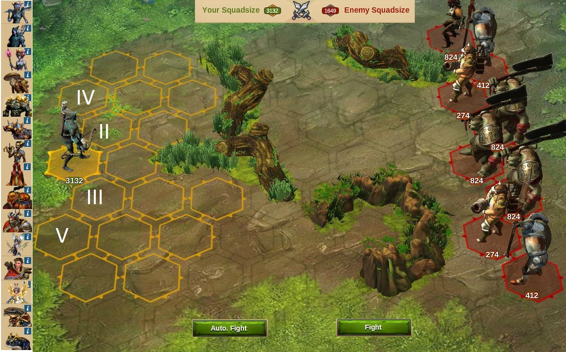
** Original screen shot off my phone, only stretched some button and moved a few things but should still be same ratio to screen shot **
Phone screens are too small for clutter. As it is, we are constantly restarting the troop loading because of small buttons too close to each other, touching the background cancels it, the arrow over button starts a fight too soon or you close out and that's right, we start over. Let me tell you how teeny tiny my hands are and my itty bitty fingers are constantly closing or touching all the wrong things.
Main Changes :
No one needs to see Relics when loading in their troops. we have already committed to doing this spot in the province by clicking fight in the previous window. Give us more space. Remove the ability to see all the stuff currently along the top of the window. Fighting doesn't require the player to know their relics, coins, supplies and there is no option to Pay Diamonds either while loading up troops.
The window should be Full Screen

the silly "Yay, you won" screen is full screen! Why do we want to see or touch any part of that background when you have given us a Big Red X to get out. Keep it simple.
X button to leave, we do not also need to see a BACK arrow button at the bottom left corner. Cover it, no transparency in the window, make it Full Screen
I have not adjusted the size of the Bars showing Enemies, and squad size number. The size of those hexagons are good. I moved them up out of the way to add space below.... Still very visual above, you wouldn't want them below the troops.
BIGGER BUTTONS for troops!!! Those info circles were constantly opening, with each troop touch and its time consuming to constantly X out of those windows! We want to tap that button and load in our troop with out extra windows constantly opening. Info circles should be HARD to open, not the other way around. If we want to stop and ask questions, we will be sure to go slow enough to activate the INFO circle if its needed. It should otherwise, not activate.
I have kept the Troops AWAY from the Fight button. Too many times i have sent half the troops i wanted.
Disaster. Mostly because i want to then, throw my phone.... This should never be possible. Fight button is now Smaller but extremely handy in the bottom right corner where our thumbs can hammer at it without accidentally closing the whole window and yep, start the whole process all over again!
LOCK your DEFAULT / PREFERRED troop building.
Ok, so my elf city defaults to the Mercenary Camp which is ridiculous and my Human city defaults to my Training Grounds and my Beta city Defaults to my barracks? GRRRRR. Every city i have to remember which arrow to tap once or twice to get to my desired troop,. That right arrow is too close to the Fight button= sent troops to early problem and the left arrow, always accidentally closing out and STARTING ALL OVER AGAIN.
My suggestion is to give us a button for each to show the desired string of ready units. Then a Lock button. So our default is set for our next province. Unlocking it allows us to set it for each tournament which of course uses different sets of troops each time.
We would benefit greatly from this as all Mobile Apps should consistently provide us the ability to work off muscle memory, not be frustrated and restart 4 or more times a province and offer us only the information we need to succeed in the current screen we are working with.

