• Dear forum reader,

    To actively participate on the forum by joining discussions or starting your own threads or topics, you need a game account and to REGISTER HERE!

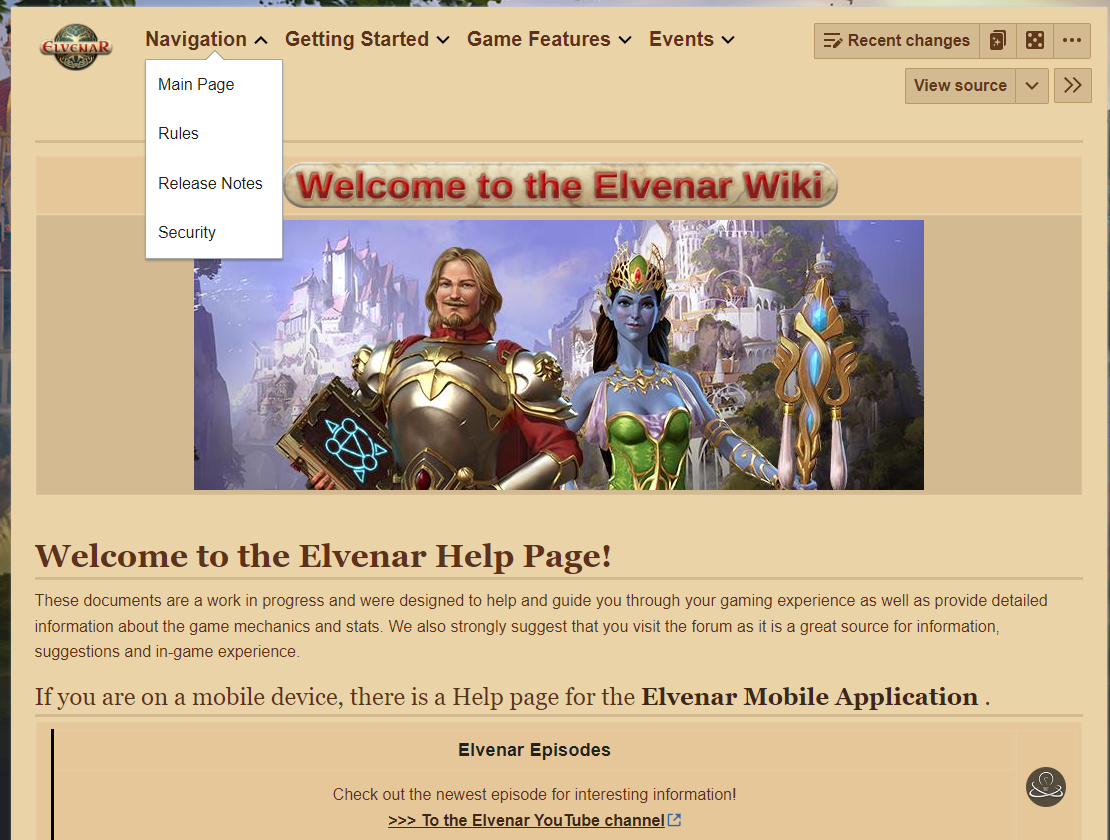
For info, new wiki.... very ugly !!!!!!!!

Biloutte91

Well-Known Member
The wiki has changed :mad::mad::mad::mad::mad::mad::mad::mad::mad::mad::mad::mad::mad::mad::mad::mad::mad::mad::mad::mad::mad::mad::mad:


Capture d’écran 2023-08-09 153559.png


Capture d’écran 2023-08-09 153629.png


What do you think of these changes?
 
Last edited:

Mrietha

Well-Known Member
Yes, I agree.
I think it would be better if they made two Wiki buttons on the help page: One take you to the Browser Version and the other would take you to the App Version.
And for the App Version: Also reducing the font/picture size of the basic app info and buttons to get the apps would be much more appealing, or puttting it in its on clickable space.
 

Biloutte91

Well-Known Member
For your information, there aren't two different wikis. It's the same wiki for the application and for the PC.

If you click on wiki on the application or if you click on wiki on PC you arrive on the same page. It's a web site.
 
Last edited:

Mrietha

Well-Known Member
Now they are giving you the option to click to a section that is devoted to the App.
It used to be the same for both, but now if you go to the App section you see images taken from the App.
Now, if they have offered the avaliblity of the App version before, I have not noticed it. The last time I went was to find info on the Hobby room. I don't remember the Introductory page looking like this.
 

FaunaWillow

Well-Known Member
I think the new look is alright.
The layout seemed a little archaic and outdated before.
The new look could use some improvements. It’s much better to scroll through on mobile (although the pages don’t fit to mobile standards)…it’s a little bland and boring on the browser, but the layout in general is smooth and easy to find everything.
There is a visual hiccup on the main page when viewing the Wiki on mobile (picture attached).
It may be a case of we just need to get used to the new change.
IMG_6249.jpeg
 

Dorfl the Clay

Well-Known Member
Amazing there was time spend on changing the interface (anybody that feels it looks better now?)... but not on correcting the errors, adding missing information and sorting out the mess of several languages within each version... e.g. the Dutch version is still full of English bits!
 
Top